In the world of design, choosing the right colors can feel like navigating a minefield. One wrong step, and your masterpiece could turn into a colorful disaster. Enter the contrast ratio checker—a hero in the shadows, ensuring your text pops and your visuals shine. It’s like having a personal stylist for your website, making sure everything’s just the right shade of fabulous.
Overview Of Contrast Ratio Checker
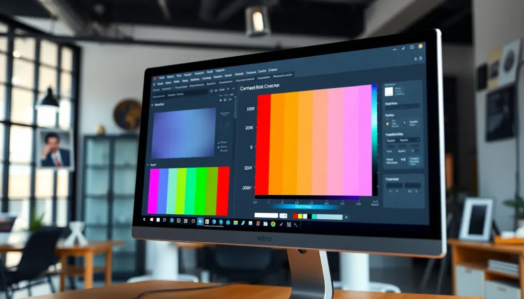
A contrast ratio checker evaluates the difference between foreground text and background colors. This tool measures visibility, ensuring that text remains readable against backgrounds. Designers frequently utilize this tool to adhere to accessibility standards, such as Web Content Accessibility Guidelines (WCAG).
Determining an appropriate contrast ratio enhances user experience. The minimum contrast ratio recommended for normal text is 4.5:1, while for large text, it is 3:1. High contrast improves readability, particularly for individuals with visual impairments.
Using a contrast ratio checker provides instant feedback, allowing designers to make informed adjustments. Many tools offer features such as color sampling and real-time ratio calculations. Users can enter hex color values or select colors from a palette to analyze their combinations effectively.
The availability of online contrast ratio checkers adds convenience. These tools are user-friendly, requiring minimal technical knowledge. Each tool typically displays visual representations of color combination effectiveness.
Monitoring and optimizing contrast ratios fosters better design practices. Stronger contrast enhances engagement, as users can navigate content more efficiently. Incorporating the checker into the design workflow promotes inclusive design, accommodating a wider audience.
By maintaining appropriate contrast levels, websites become more visually appealing and accessible. This approach ultimately leads to higher satisfaction rates among users. Implementing a contrast ratio checker proves to be an essential step in achieving a balanced and functional design.
Importance Of Contrast Ratio
Contrast ratios play a vital role in design, especially regarding visibility and accessibility. They ensure that text stands out against backgrounds, enabling all users to engage with content effectively.
Accessibility Considerations
Enhancing accessibility involves adhering to established guidelines. The Web Content Accessibility Guidelines (WCAG) recommend a minimum contrast ratio of 4.5:1 for regular text. Achieving this standard significantly impacts individuals with visual impairments. Features like larger text allow for a lower minimum ratio of 3:1, accommodating a broader audience. User-friendly contrast ratio checkers support designers in meeting these standards, ensuring websites are inclusive. Each step towards improved contrast fosters a welcoming environment for everyone.
Design Best Practices
Effective design relies on a clear visual hierarchy. Using a higher contrast ratio enhances readability, guiding users’ attention to vital information. Selecting colors mindfully lets designers create aesthetically pleasing and functional layouts. Implementing consistent contrast ratios across all elements ensures a cohesive look. Tools like contrast ratio checkers help identify areas needing adjustment, facilitating a seamless design process. Prioritizing optimal contrast not only beautifies websites but also elevates user satisfaction.
Features Of A Good Contrast Ratio Checker
A quality contrast ratio checker features specific elements that enhance user experience and effectiveness. Designers rely on these features to create visually appealing and accessible content.
User Interface
Intuitive user interfaces characterize effective contrast ratio checkers. Simplicity enables users to navigate the tool easily. Clear instructions guide users through color input processes, while visual aids illustrate contrast ratios instantly. Options for color input, like hex codes and color pickers, increase flexibility. Customizable settings enhance personalization tailored to design preferences. Additional features, like presets for accessibility standards, help ensure compliance with guidelines like WCAG. Engaging designs maintain user interest, further fostering a more productive experience.
Accuracy And Reliability
Accurate measurements enhance the reliability of contrast ratio checkers. Consistency in ratio calculations ensures designers make informed choices. Many tools utilize established algorithms to guarantee precision, supporting adherence to accessibility compliance. Instant feedback allows for quick adjustments, improving overall design quality. Well-reviewed checkers often exhibit reliable performance in various conditions. Users appreciate detailed reports that help refine color combinations. Trustworthy tools contribute to effective design outcomes, promoting accessibility and a better user experience across digital platforms.
How To Use A Contrast Ratio Checker
Using a contrast ratio checker is straightforward and essential for creating accessible designs. This tool ensures text visibility against backgrounds, enhancing user experience.
Step-By-Step Guide
- Choose a tool that fits your needs. Online contrast ratio checkers are widely available and user-friendly.
- Select foreground and background colors by inputting color values or using color pickers.
- Observe the displayed contrast ratio. The ideal ratio for normal text is 4.5:1, while large text should meet at least 3:1.
- Make adjustments based on feedback. Change colors as needed to meet or exceed the recommended ratios.
- Re-check after any modifications to ensure compliance with accessibility standards, such as WCAG.
Common Mistakes To Avoid
Designers often overlook the color contrast of disabled elements. Not accounting for these can lead to poor accessibility. Ignoring different lighting conditions affects how users perceive colors. Using only one contrast checker tool risks overlooking additional insights. Confusing colors with similar brightness can mislead designers. Always rely on precise color codes to avoid inconsistencies. Finally, neglecting to review mobile versions can compromise user experience on smaller screens.
Recommended Contrast Ratio Checkers
Numerous tools exist to help designers evaluate contrast ratios effectively. These contrast ratio checkers simplify the process of ensuring text visibility across various backgrounds.
| Tool Name | Features | Website |
|---|---|---|
| WebAIM Contrast Checker | Offers an intuitive interface, color input options, and detailed feedback on the contrast ratio. | WebAIM |
| Accessible Colors | Provides customizable settings for multiple accessibility standards and real-time ratio calculations. | Accessible Colors |
| Contrast Checker | Supports color sampling for quick checks and allows users to see comparisons for different color pairs. | Contrast Checker |
| Colorable | Lets users select colors visually and immediately checks the contrast ratio against guidelines. | Colorable |
| Color Safe | Generates color palettes that meet WCAG standards, ensuring designs remain compliant and visually appealing. | Color Safe |
Selecting the right tool can enhance the design process significantly. Good checkers offer features that streamline the evaluation of color combinations, allowing designers to save time and focus on creativity without compromising accessibility standards.
Designers benefit when using tools that provide instant feedback. Reliable contrast ratio checkers minimize errors, ensuring that all users can engage with content effectively. Making informed adjustments becomes straightforward with these resources, reinforcing the commitment to inclusive design practices.
Utilizing a contrast ratio checker is essential for any designer aiming to create accessible and visually appealing websites. These tools not only ensure compliance with established guidelines but also enhance the overall user experience. By prioritizing optimal contrast ratios, designers can effectively guide users’ attention and improve readability for everyone, including those with visual impairments.
The right contrast ratio checker simplifies the design process, offering valuable insights and immediate feedback. With a range of user-friendly options available, designers can easily refine their color choices and create cohesive layouts. Embracing these tools is a step toward fostering inclusivity and satisfaction in digital spaces.